Featured project / 00
Logistics Service Performance Analytics
Investigating shipment delays, service quality, and customer impact across 10,324 logistics records
At a glance
Project overview
Case study content
The problem: service quality is hidden across shipment, delay, cost, and customer signals
In logistics, service quality is rarely visible in one clean metric. A shipment can be delivered late, missing proof-of-delivery timing, linked to an incident, affected by a gateway bottleneck, or recorded with incomplete cost information. Each signal tells part of the story, but operations teams need to understand how those signals connect before they can decide where to act.
This project simulates Service Quality Analyst work in an international logistics context. It starts with raw shipment-level data and reframes it into an analytical workflow for reviewing service performance, delay patterns, operational bottlenecks, and customer experience signals.
The central question was:
How can an operations team identify the key drivers of shipment delay and prioritize actions to improve service quality and customer satisfaction?
The goal was not to make a dashboard that simply displays logistics KPIs. The goal was to build an evidence-based analysis path: assess the data, validate patterns through SQL, model the analytical tables, design Power BI pages around business questions, and turn the findings into practical recommendations with clear limitations.
Role: solo analyst, from raw data preparation to business recommendations
This was a personal portfolio case study completed end to end as a solo analyst, covering the work of a Data Analyst, Service Quality Analyst, and Business Analytics practitioner:
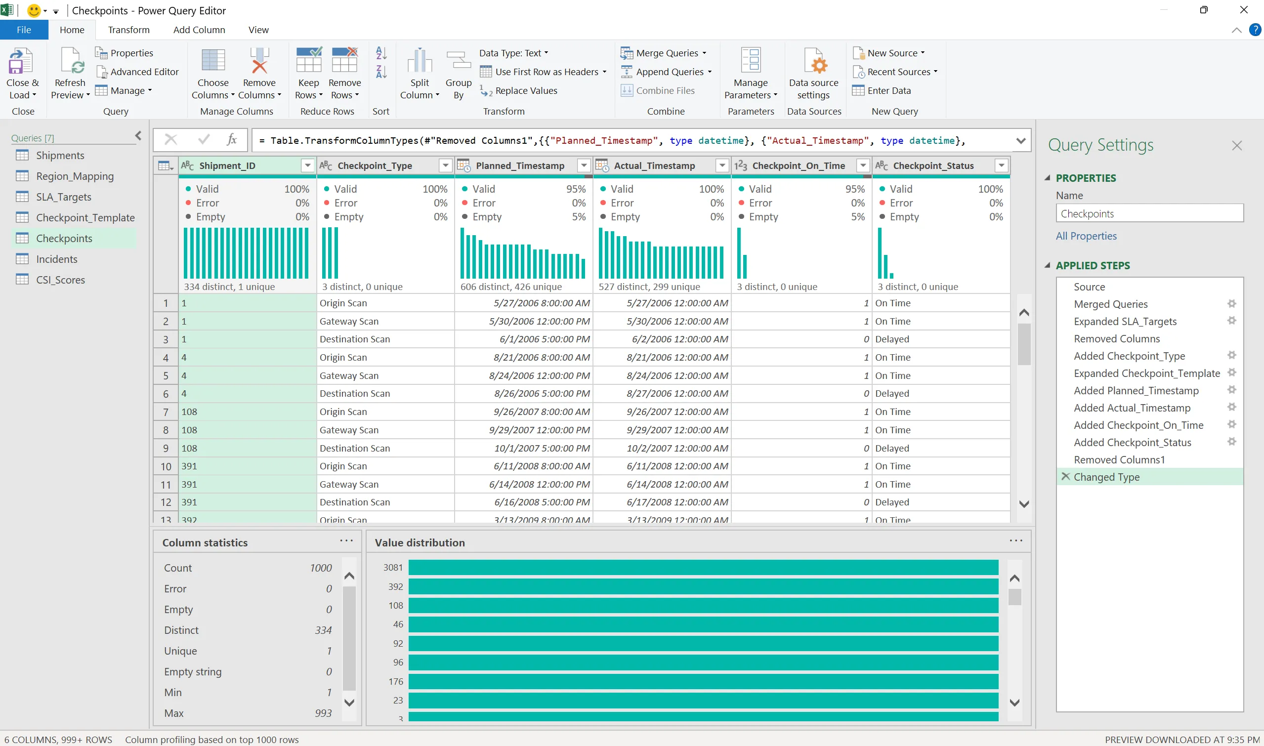
- Prepared the dataset using Excel and Power Query
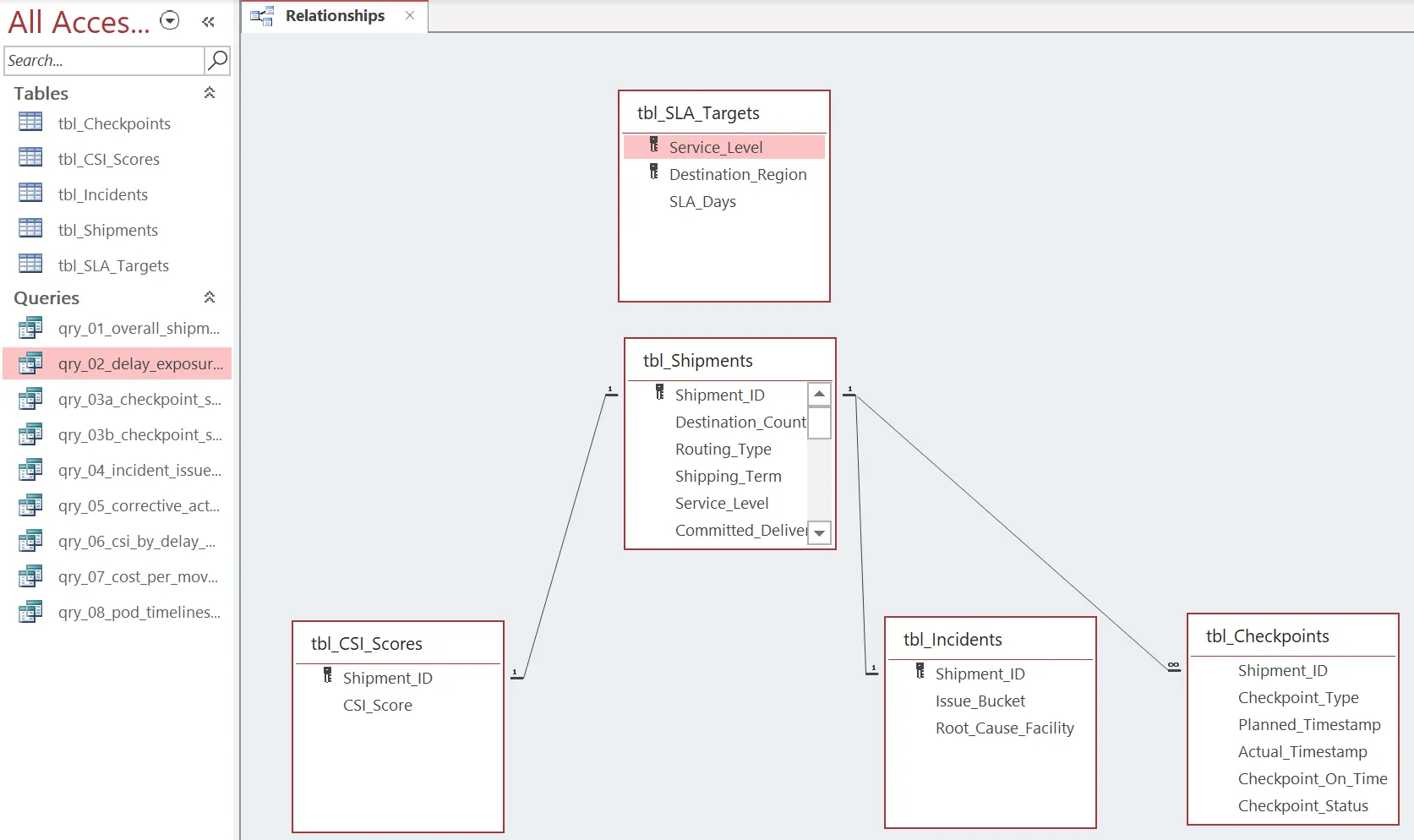
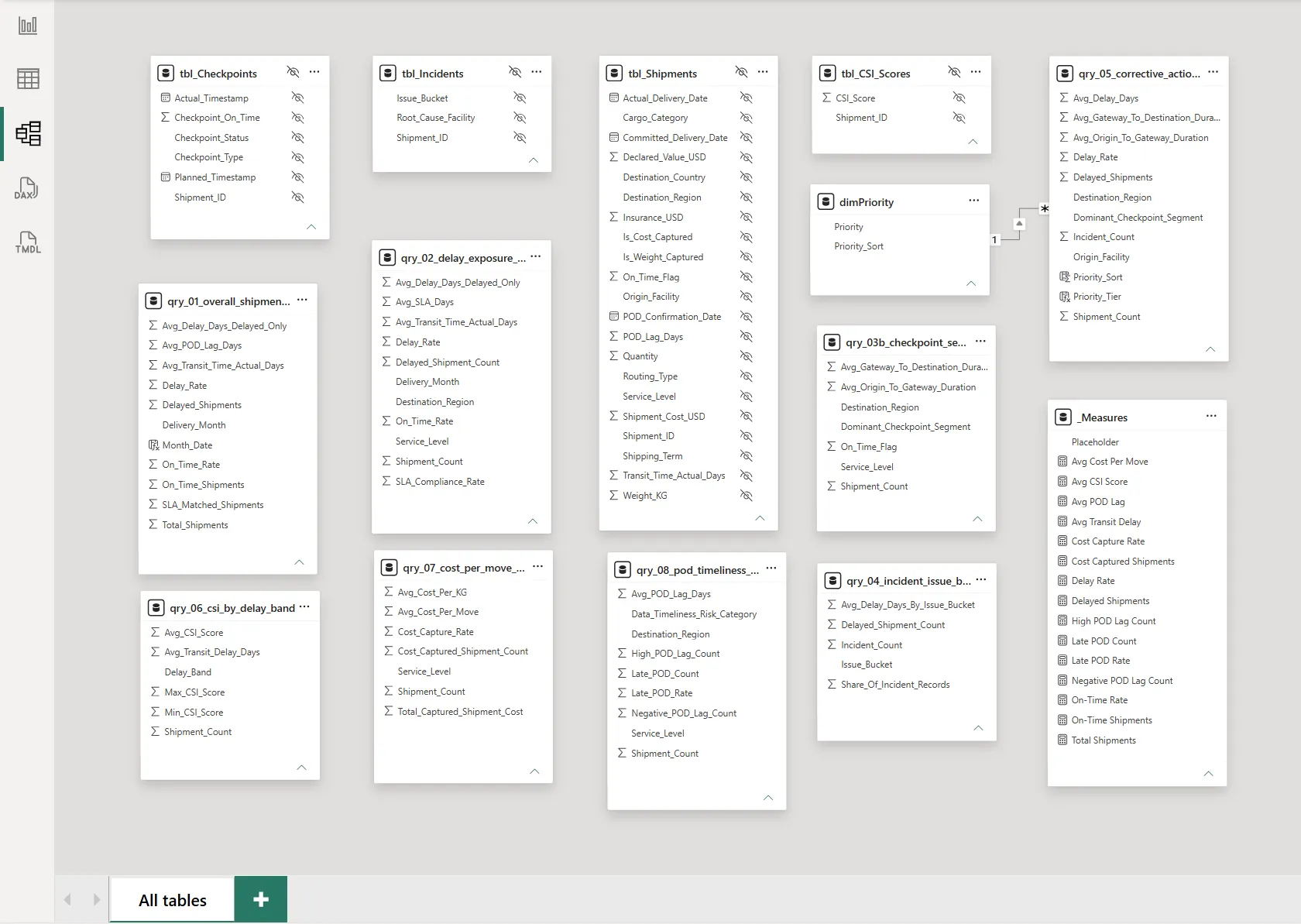
- Reframed the raw shipment data into five analytical tables: shipments, SLA targets, checkpoints, incidents, and CSI scores
- Used Microsoft Access and Access SQL to investigate the data before building the Power BI report
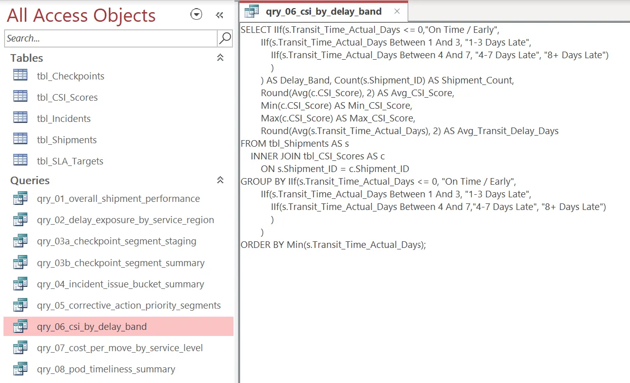
- Wrote nine SQL investigation queries to validate patterns, check assumptions, and inspect service-quality signals
- Designed the analytical data model for Power BI
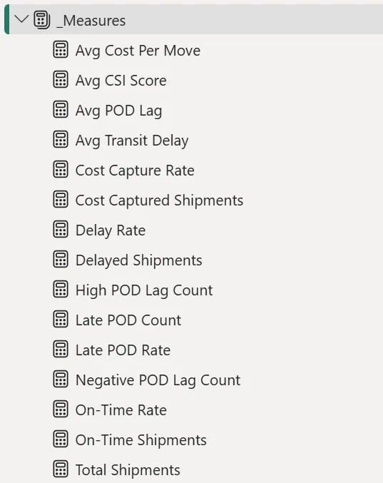
- Built DAX measures for operational KPIs such as On-Time Rate, Delay Rate, CSI Score, Cost Capture Rate, and POD Timeliness
- Created four Power BI dashboard pages around executive review, bottlenecks, root cause analysis, customer impact, priorities, and data quality
- Wrote business recommendations covering gateway operations, data entry, POD timeliness, cost visibility, and KPI governance
- Documented the data assumptions and limitations so the case study did not overclaim beyond the portfolio dataset
The process: investigation before visualization
The most important design decision was to investigate before visualizing. A logistics dashboard can look convincing even when the underlying data relationships are weak, so Power BI was treated as the final communication layer, not the starting point.
The first stage was data preparation. The portfolio dataset was simulated and reframed from a public supply chain dataset, then structured into a logistics service-quality scenario with 10,324 shipment records. Power Query was used to shape the data into analysis-ready tables, while the enrichment logic created separate analytical views for SLA targets, checkpoints, incidents, and CSI scores. This separation mattered because delay performance, operational events, cost visibility, and customer signals should not all be treated as one flat table if the goal is to diagnose service quality.
The second stage was data quality assessment: checking for the kinds of issues that would affect interpretation — missing or incomplete operational fields, cost capture gaps, proof-of-delivery timing, and fields that were useful for analysis but should be treated as proxies rather than direct operational truth. Origin_Facility, for example, was kept as a proxy field rather than described as a real facility network.
The third stage was SQL investigation in Microsoft Access. Nine Access SQL queries were used to inspect the prepared tables before moving into Power BI — checking where delays concentrated, which shipment attributes appeared alongside poor service performance, whether cost visibility was complete enough to support financial interpretation, and how incident or checkpoint signals could be connected to customer-facing outcomes.
Only after that came Power BI. The data model was built around the five analytical tables rather than a single spreadsheet export, and DAX measures were defined for the core KPIs: On-Time Rate, Delay Rate, CSI Score, Cost Capture Rate, and POD Timeliness. The report pages were structured to move from summary to diagnosis:
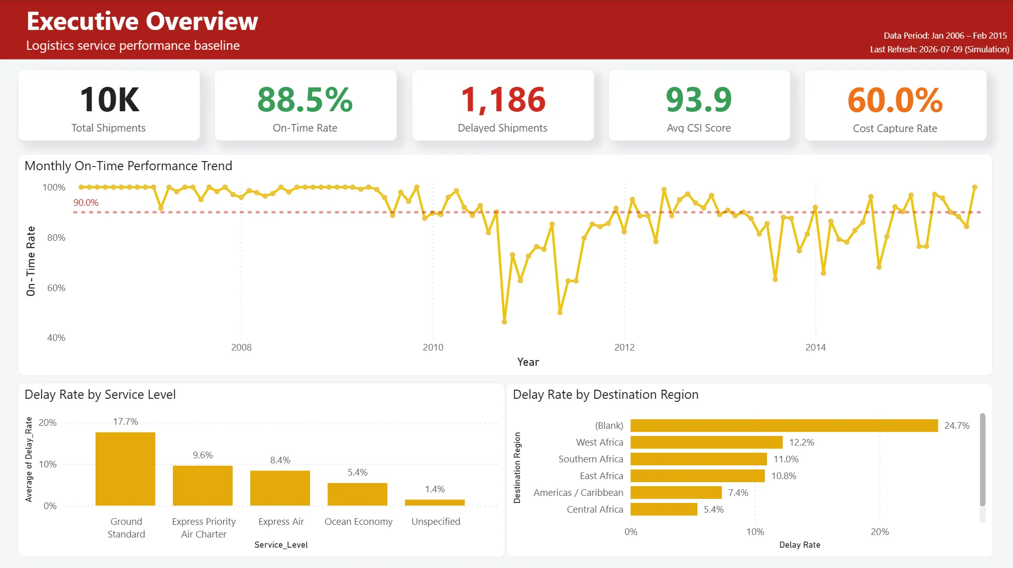
- Executive Overview gives a high-level view of service performance through the core KPIs — designed for quickly spotting whether service quality is stable or whether specific areas need attention.
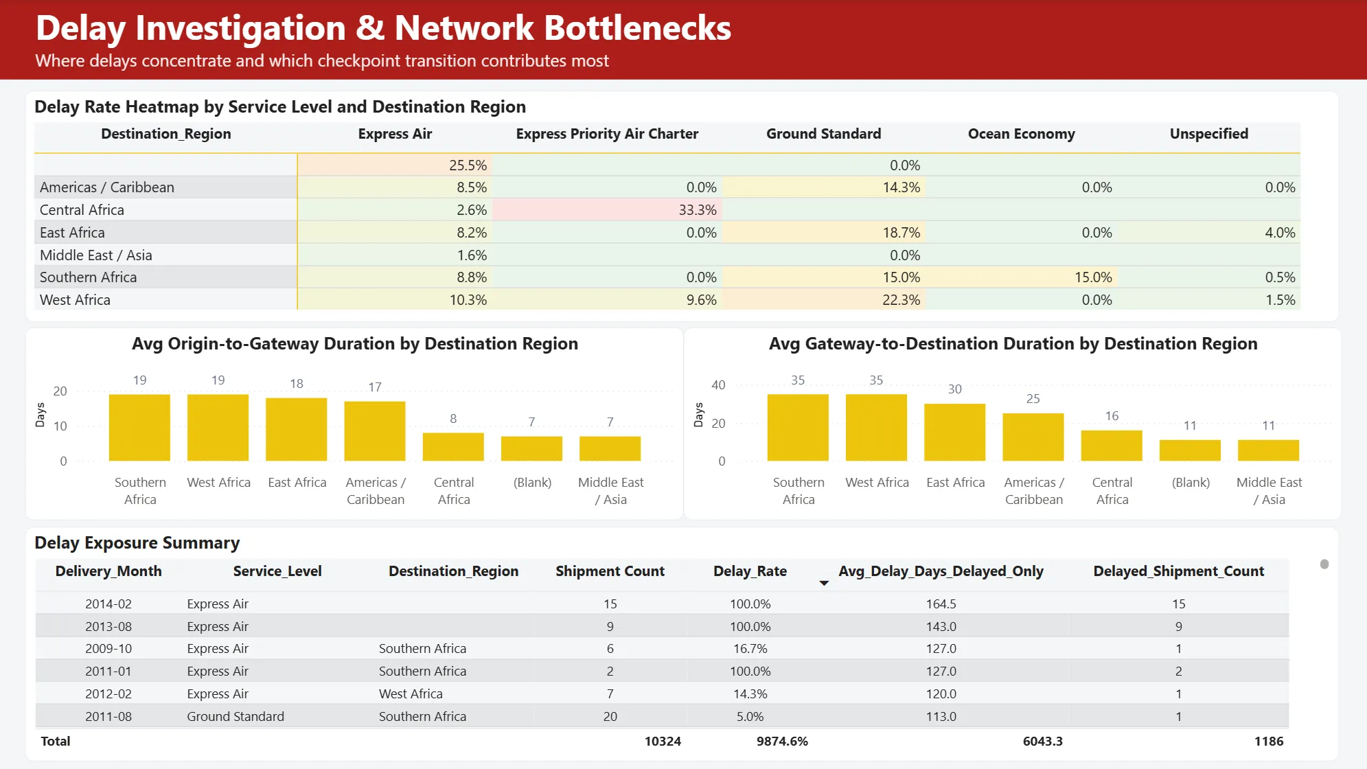
- Operational Bottlenecks focuses on where delays and service issues appear to concentrate, such as gateway-related activity or shipment groups with weaker timeliness.
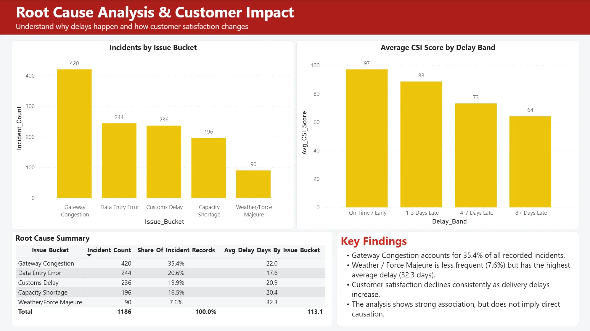
- Root Cause Analysis & Customer Impact connects operational signals to customer-facing indicators — without claiming proven causality — so a reviewer can see where poor operational performance may align with weaker customer experience signals.
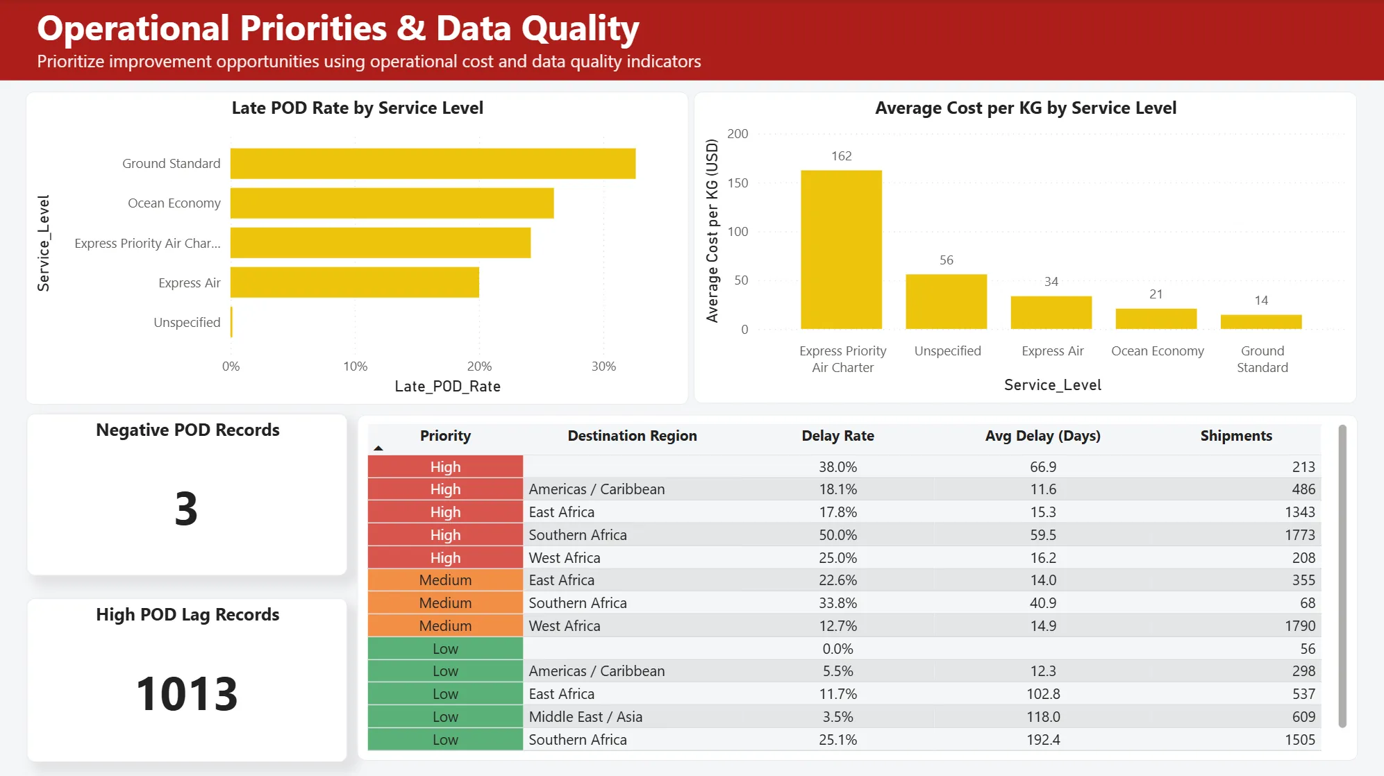
- Operational Priorities & Data Quality turns the analysis into decision support, summarizing recommendation areas while keeping data quality caveats visible, especially around cost capture and POD timeliness.
Results on the portfolio dataset
On the completed portfolio version, the project produced:
- 10,324 shipment records prepared for service performance analysis
- Five analytical tables: shipments, SLA targets, checkpoints, incidents, and CSI scores
- Nine Access SQL investigation queries used before dashboard development
- Four Power BI dashboard pages
- KPI coverage for On-Time Rate, Delay Rate, CSI Score, Cost Capture Rate, and POD Timeliness
- Business recommendation areas covering gateway operations, data entry, POD timeliness, cost visibility, and KPI governance
These outputs describe the portfolio dataset and analytical workflow. They should not be interpreted as verified performance metrics from a real logistics company or proof of operational improvement.
Biggest takeaway: dashboarding is the last layer, not the first
The strongest part of this project was the decision to treat dashboarding as only one layer of the analysis. The real work happened before the visuals: deciding what each table represented, which fields were strong enough for interpretation, which fields needed caveats, and how to separate evidence from assumption.
SQL was where that discipline actually got enforced. Power BI is good at summarizing patterns, but the nine Access SQL queries forced a slower, more deliberate inspection first — a checkpoint that verified the dashboard questions were grounded in the dataset rather than imposed on top of it. That same discipline carried into how the KPIs were modeled: On-time delivery, delay rate, POD timeliness, cost capture, incidents, and CSI score are not interchangeable metrics, and treating them as connected but distinct signals — rather than collapsing them into one score — made the report more useful than a single KPI page.
It also shaped how the writing was handled at the end. Because the dataset was simulated and enriched for a case study, it would have been easy to overstate customer satisfaction or business impact — and recommendations were intentionally framed as analytical directions to review, not final operational decisions. The stronger version of this project is the more transparent one: it demonstrates an analytical workflow, not a production transformation.
Limitations
- The dataset was simulated and reframed from a public supply chain dataset, not real logistics company data
- Checkpoints, incidents, and CSI Score are deterministic enrichments created for the case study
Origin_Facilityis a proxy field, not a verified operating facility- CSI Score should not be interpreted as real customer feedback
- Recommendations are analytical directions and need validation with real operational data before implementation
- The project does not claim production deployment or measured business impact
If I did it again
- Validate the data model with a real logistics operations stakeholder
- Replace deterministic enrichments with real checkpoint, incident, customer feedback, and cost records
- Add a formal data dictionary and lineage notes for each analytical table
- Expand the SQL investigation layer into a repeatable validation script set
- Add sensitivity checks to see how recommendations change when proxy fields or enriched scores are removed
- Build a short walkthrough explaining how an operations team should move from dashboard signal to investigation action
Case study
Project Screenshots
Start a conversation
Have a question worth exploring?
I’m open to data roles, thoughtful collaborations, and conversations about the work behind this case study.
Get in touch